
Home • News & Insight • Your customers are mobile. Is your business?
Posted by
Alan Cantes
05th Jan 2012
Posted in the
Mobile
category
According to research by Gartner, by 2013 mobile phones will overtake PCs as the most common web access device. We are already starting to see large mobile web usage levels on popular social media platforms such as those evidenced at Facebook where as of today 350 million active users out of a total of 800 million users access the site via mobile devices. With the continuing growth in the mobile market, and the gradual increase in affordability for such devices it is of course logical to expect the shift towards the mobile web to continue at pace. Gartner are clear when they state that ‘websites not optimized for the smaller-screen formats will become a market barrier for their owners’.
First off, we think you should treat the emergence of the mobile web as an opportunity and not necessarily a threat. To start with, have you checked how your website renders on a mobile device? The chances are it will look very similar compared to how it looks on a PC, provided your current designer has acted with competence and adhered to a solid foundation of Web Standards-compatible code. If it doesn’t display properly then get in touch with us as we can help rectify any glitches that occur.
In our opinion, it’s far more important to look at your website on a mobile device with fresh eyes. Sure, it looks okay at a small scale but you will probably need to constantly zoom in to read the content on each page clearly, and then zoom out again to find your way around the navigation to move through the site - a mobile viewing experience that is far from optimal. A mobile-optimised website will be geared towards a different audience and needs to load a lot quicker, have a simplified navigation, larger ‘finger compatible’ buttons, and legible text content. Mobile users are far less likely to hang around, so your mobile website needs to transport visitors to the content they want quickly and easily.
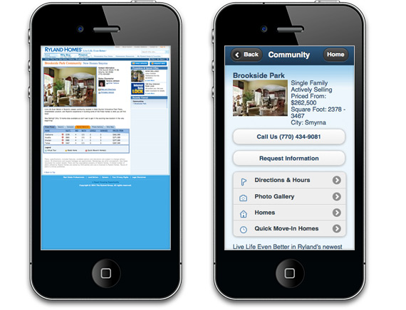
The two phones above demonstrate how the same page can look radically different depending on whether it is optimised for mobile devices. The left screen shows the standard desktop version of the page, the right shows a mobile-optimised version, specifically geared for mobile device users.
In short, probably not. Providing a mobile-optimised version of your website can in most cases be treated as an extension of your existing website. Some clever coding on the pages simply informs the website to display a mobile version if it detects you are using a mobile device. The website in turn can either be an amended version of your current desktop-friendly site with elements either shifted, re-emphasised or omitted, or a completely separate incarnation built from the ground up solely for mobile devices. As you would expect, prices vary depending on how involved the project is, and we are more than happy to talk you through your options and provide a quotation to suit.
Google is never far from the forefront of the web evolution, and they have just launched their promotional website to educate business owners on the main benefits of offering your clients a mobile-optimised website. You can find out more details and test your site by visiting Google Go Mo. It’s certainly worth a read.
And of course we also provide advice and development expertise in implementing changes to your website to cater for your growing mobile user-base. Get in touch with us and we'll show you how we can help your website go mobile.
Original image courtesy of steefafa on Flickr.
Search news by key phrase
Search news by category